Project Overview
- Streamline vendor management processes.
- Provide real-time visibility into procurement activities and supplier performance.
- Reduce reporting delays and improve decision-making speed.
Team & Roles
| Contributor | Role | Responsibilities |
| Parithimal Saravanan | UX Architect / Product Owner | Led user research, journey mapping, and dashboard design. Ensured alignment with user mental models and business logic. |
| Andrew Nicholas James | Subject Matter Expert | Defined product vision, prioritized features, and ensured strategic alignment. |
| Prasanna Medam | Power Bi Developer | Translated UX designs into functional dashboards, implemented logic, and optimized usability. |
Between February and June 2025, I produced all major UX deliverables and presented to the client. I collaborated closely with a Product Manager and a Power BI Developer to ensure the final solution was both user-centric and technically sound.
The Challenge
Procurement teams were heavily dependent on Excel for tracking KPIs, which introduced several operational inefficiencies:
- Delayed decision-making Slow feedback loops stalled progress and momentum.
- Lack of accountability No clear ownership led to unresolved issues.
- Missed insights Valuable input got lost in scattered channels.
- Disjointed workflows Teams operated in silos, causing inefficiencies.
- Manual data handling Time wasted on repetitive, error-prone tasks.
- Limited visibility Stakeholders lacked a clear view of feedback status.
From a UX standpoint, the absence of a centralized, role-aware dashboard created friction in decision-making and data exploration. The challenge was to design a solution that offered:
- Role-based access tailored to procurement functions
- Intuitive data exploration for complex datasets
- Real-time insights to support agile and informed decisions
Discovery & Research
Stakeholder Interviews & Key Insights
To uncover the root challenges in feedback management, I conducted interviews with a diverse group of stakeholders — including buyers, managers, department heads, project managers, and analysts. The goal was to understand:
- Current feedback collection methods.
- Pain points in the existing process.
- Desired outcomes from a digital solution.
Key Findings
The interviews revealed several recurring issues:
- Cognitive overload from manual KPI tracking led to frequent errors.
- Poor data discoverability due to the absence of a centralized dashboard.
- Workflow friction caused by lack of integration between tools and teams.
Experience Goals
These insights shaped our strategic direction. The solution needed to:
- Enable collaboration across departments.
- Automate repetitive tasks to reduce manual effort.
- Ensure data integrity through structured input and traceability.
Mapping Procurement Workflows
To ensure the platform addressed key procurement needs, I mapped out the following critical workflows:
- Spend Analysis Empowered users to explore purchasing trends and identify cost optimization opportunities.
- Process Metrics Tracked procurement efficiency through cycle times, compliance rates, and bottlenecks.
- Cost Saving Initiatives Enabled visibility into negotiated savings and realized benefits.
- Real Cost vs. Statement of Work (SoW) Highlighted discrepancies between projected and actual spend to improve forecasting accuracy.
UX Insights Informed by Business Logic
We aligned UX decisions with the detailed business logic captured in the dashboard specifications.
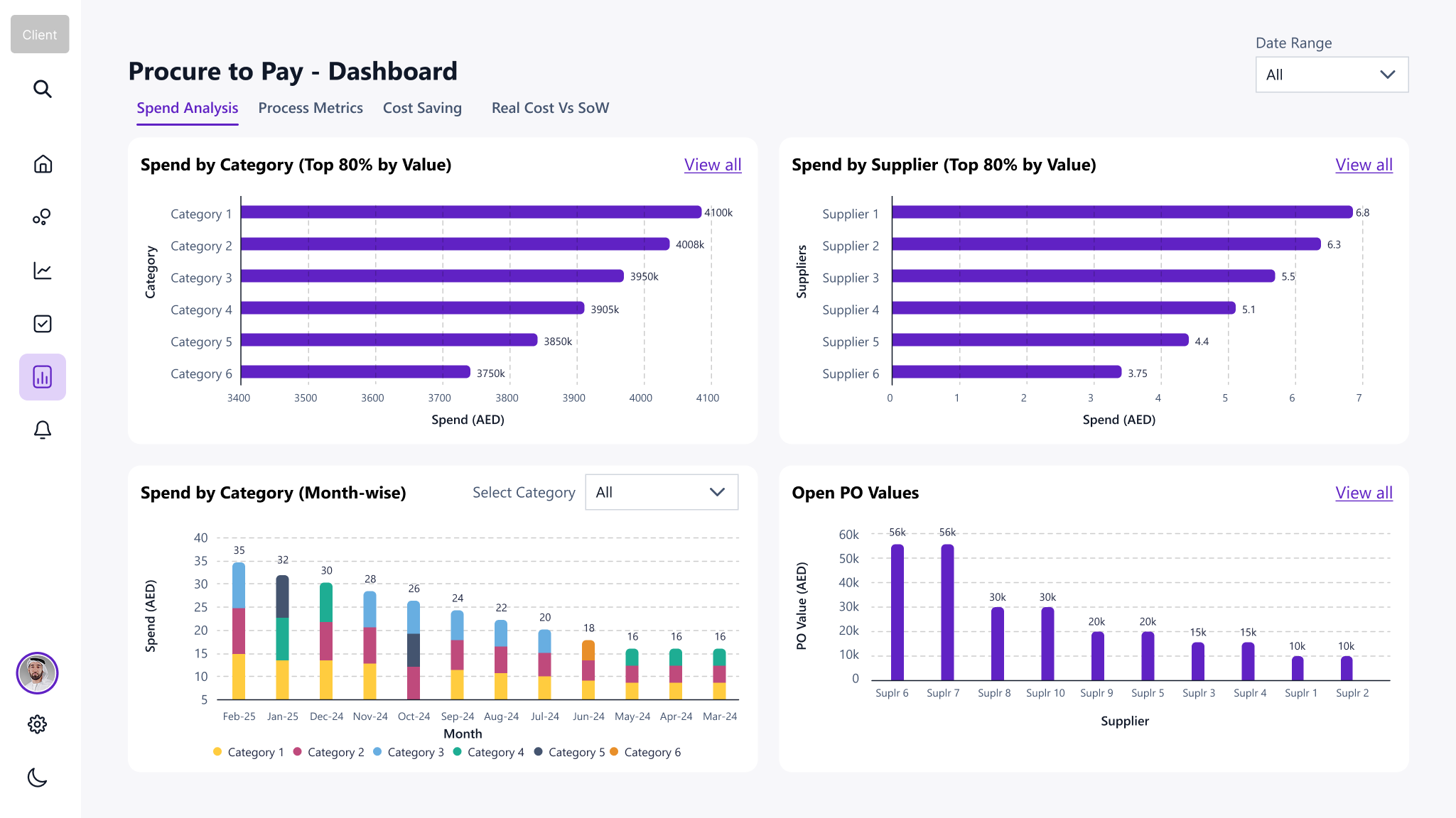
Spend by Category (Top 80%)
This chart identifies the top categories contributing to 80% of procurement spend, enabling Pareto analysis and strategic focus.
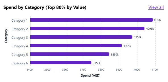
- Purpose: Pareto analysis for strategic focus
- Logic: Identify categories contributing to 80% of total spend using invoiced amounts.
- UX Design: Visualized Pareto analysis with drill-down capability.
- Interaction: Clicking a category navigates to detailed breakdown (sub-categories, suppliers, projects).
- Example: If total spend is AED 100,000, display categories contributing AED 80,000.
| Data Creation Scenarios | Test Case Scenarios |
|
|
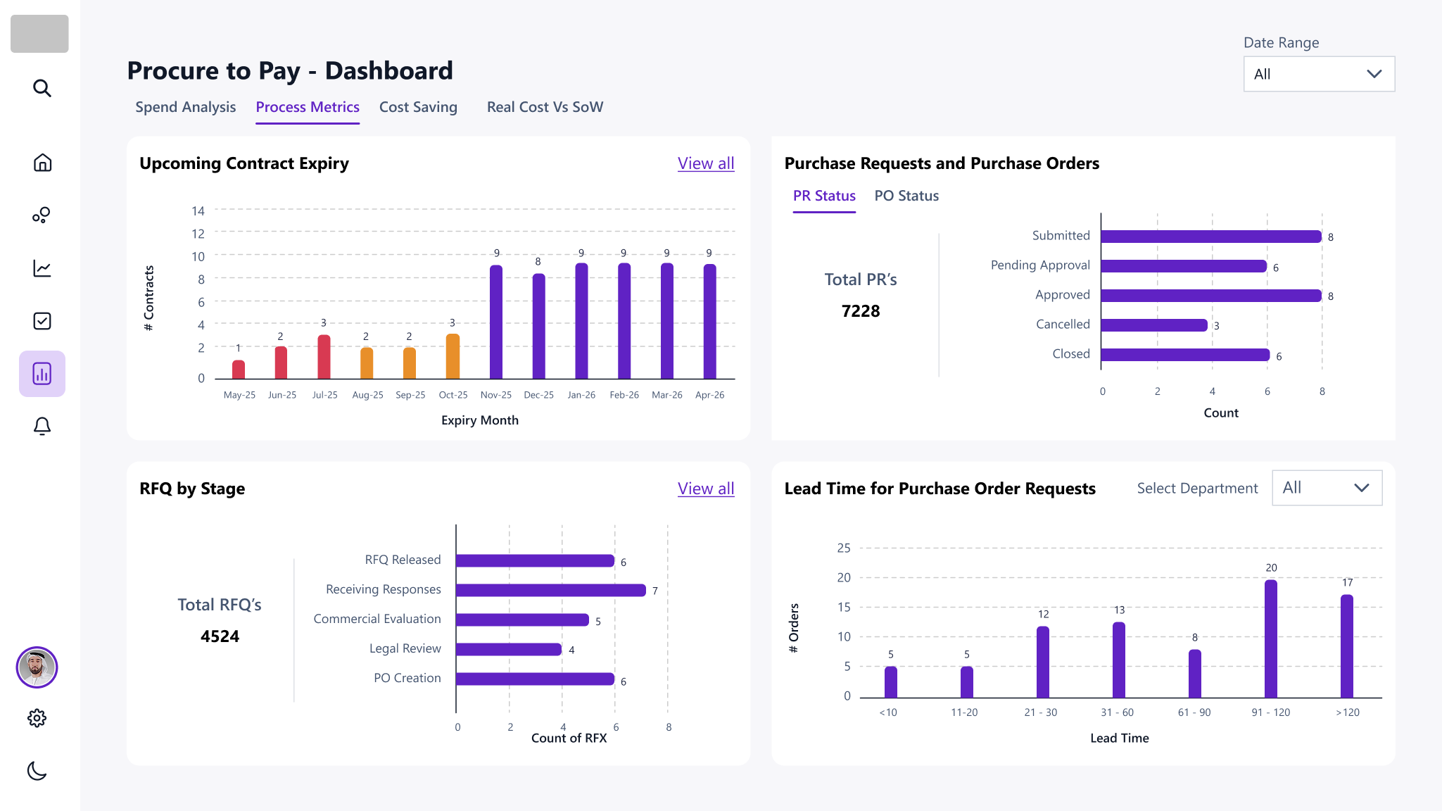
Upcoming Contract Expiry
Contracts nearing expiry area color-coded to indicate urgency:
- Red <3 months
- Orange 4 to 6 months
- Purple >6 months

- Purpose: Visual urgency indicators
- Logic: Highlight contracts nearing expiry using color-coded bars.
- UX Design: Visualurgency indicators (red/orange/purple) based on months to expiry.
- Interaction: Drill-down to contract details by month.
- Example: Contracts expiring <3 months shown in red; 4-6 months in orange.
| Data Creation Scenarios | Test Case Scenarios |
|
|
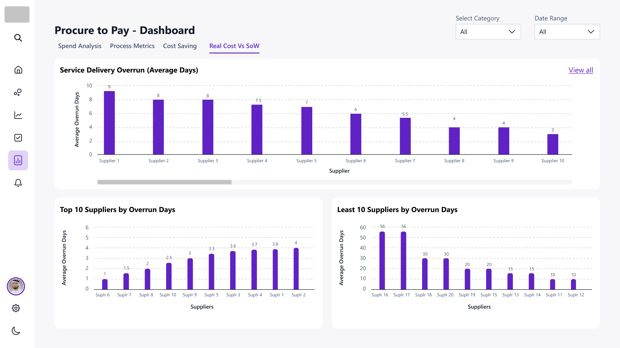
Service Delivery Overrun
This bar chart tracks delays between committed and actual delivery dates for purchase orders, helping teams monitor supplier performance and address fulfilment inefficiencies.

- Purpose: Monitor supplier performance
- Logic: Calculate delivery days using committed and actual dates.
- UX Design: Supplier level overrun indicators
- Interaction: Drill-down to Po level delivery details
- Example: Supplier X has e POs with delivery overruns of 5-10 days.
| Data Creation Scenarios | Test Case Scenarios |
|
|
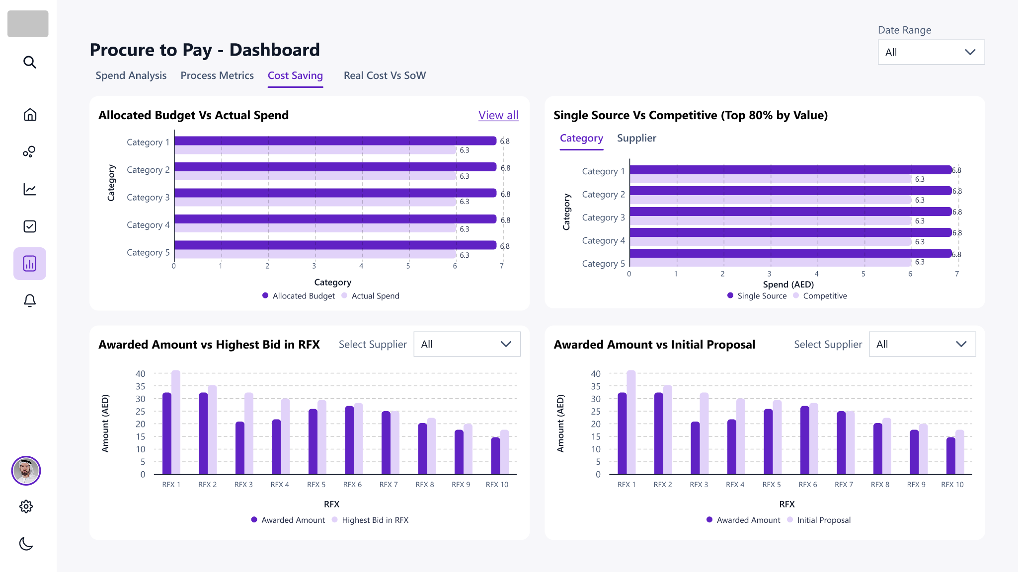
Single Source vs Competitive
This comparative chart segments procurement spend based on sourcing type—orders with RFPs are marked as competitive, while those without are single source—helping teams assess procurement transparency and sourcing strategy effectiveness.

- Purpose: Assess sourcing strategy effectiveness
- Logic: Segregate spend based on presence of RFP number.
- UX Design: Tabs for Category and Supplier views, with tooltips and callouts.
- Interaction: Hovering reveals sourcing type and spend breakdown.
- Example: Display “Single Source” spend for orders without RFP and “Competitive” for those with RFP.
| Data Creation Scenarios: | Test Case Scenarios |
|
|
Design & Prototypes
Using the business logic as a foundation, I created:
- Low-fidelity wireframes to explore visual hierarchy and storytelling.
- High-fidelity mock-ups for stakeholder validation.
- Dummy Excel datasets to simulate real data and test interactions.
Each visualization was designed to reflect the logic and metrics outlined in the Excel file, ensuring data accuracy, user comprehension, and task relevance.
Implementation Support
To ensure a smooth transition from design to implementation, we adopted a UX-driven enablement strategy that bridged the gap between design intent and technical execution—especially important as the Power BI developer was new to the Power Apps data architecture.
Dummy Dataset Creation
To accelerate development and validate the dashboard logic early, I created a dummy Excel dataset simulating procurement data such as:
- Supplier profiles
- Category and sub-category classifications
- Project attributes
- Budget and spend values
This allowed the developer to build and test dashboard components without waiting for backend integration. It also enabled early validation of:
- Data visualization logic
- Interaction patterns
- Layout responsiveness
Data Mapping & Schema Definition
To reduce ambiguity and ensure consistency, I documented the data schema and mapped each metric to its corresponding D365 table and column. For example:
- Spend by Category ProductCategories.ParentProductCategoryName, PurchaseOrderLinesV2.Spend mAED.
- Actual Spend VendorInvoiceLines.NetAmount.
- Budget BudgetControlStatisticsByDimensions.TotalRevisedBudget
This mapping ensured that the developer could confidently align visuals with backend data structures.
Validation & QA
- Dummy data testing allowed us to validate visual logic and user flows before live data was available.
- Bug tracking was done using Excel-based QA logs, where issues like incorrect values, missing legends, and drill-through errors were reviewed and resolved.
- Stakeholder demos using simulated data helped gather feedback early and refine the dashboard iteratively.
This collaborative, modular approach minimized rework, de-risked integration challenges, and ensured that the final dashboard was both technically robust and user validated.
Data Validation Process

| Tools | Purpose | Why | Benefits |
| Microsoft Excel | Simuate realistic procurement data before backend integration. | Created mock datasets for employees, suppliers, categories, contracts, and budgets to test dashboard logic and output | Enabled early usability testing and visual QA without waiting for live data. |
| D365 Schema + Excel Docs | Ensure each chart pulls data from the correct tables and columns. |
Mapped metrics like:
|
Maintained semantic consistency and reduced integration errors. |
| Internal QA Tracker | Bug review and issue tracking |
Reviewed charts for:
|
Ensured visual and functional accuracy. |
| Power BI Desktop | Validate interaction logic and visual responsiveness. | Tested logics, slicers, drilldowns, and export-to-Excel features using dummy data. | Iterative design reviews and stakeholder demos. |
| Microsoft Outlook + Teams + PPT | Validate UX decisions with end users and business owners. | Conducted walkthroughs of high-fidelity mock-ups and interactive Power BI reports. | Aligned UX with stakeholder expectations. |
Impact & Results
The final dashboard delivered:
- Centralized insights replacing fragmented Excel workflows.
- Role-based views supporting buyers and managers.
- Improved decision-making through visual clarity and data integrity.
- High stakeholder satisfaction due to timely delivery and collaborative design.
This case study demonstrates how UX strategy, business logic, and technical feasibility can converge to deliver a meaningful, impactful solution.
